Tuesday, March 31, 2015

Creating a Tile Sheet to make mapping easier

If you are a map editor such as Tiled, to create maps that can be saved as a graphic and uploaded for online gaming, one thing you may want to take the time to do: make a tile sheet.

In Photoshop (and I believe you can do this in GIMP as well but will have to check the procedure), create a document in multiples of your grid size. Because many of my digital tiles are created in a 140 x 140 pixel grid system, that is the base multiplier used. For example, five tiles wide by let's say, ten tiles tall, would yield a document of 700 pixels by 1400 pixels.

 And for DPI, you can set it up minimum of 72, but if you set a 200 dpi, or even a 300 dpi, it should not affect the copy and paste of individual tiles into the new document. 

To make gridding easier and layout as well, I usually subdivide my base tiles into four subdivisions. For a 140 pixel tile, that would be 35 pixels. You can set it up in File --> Preferences --> Guides, Grid & Slices

In View - click Snap, and then Show --> Guides, Show --> Grid.

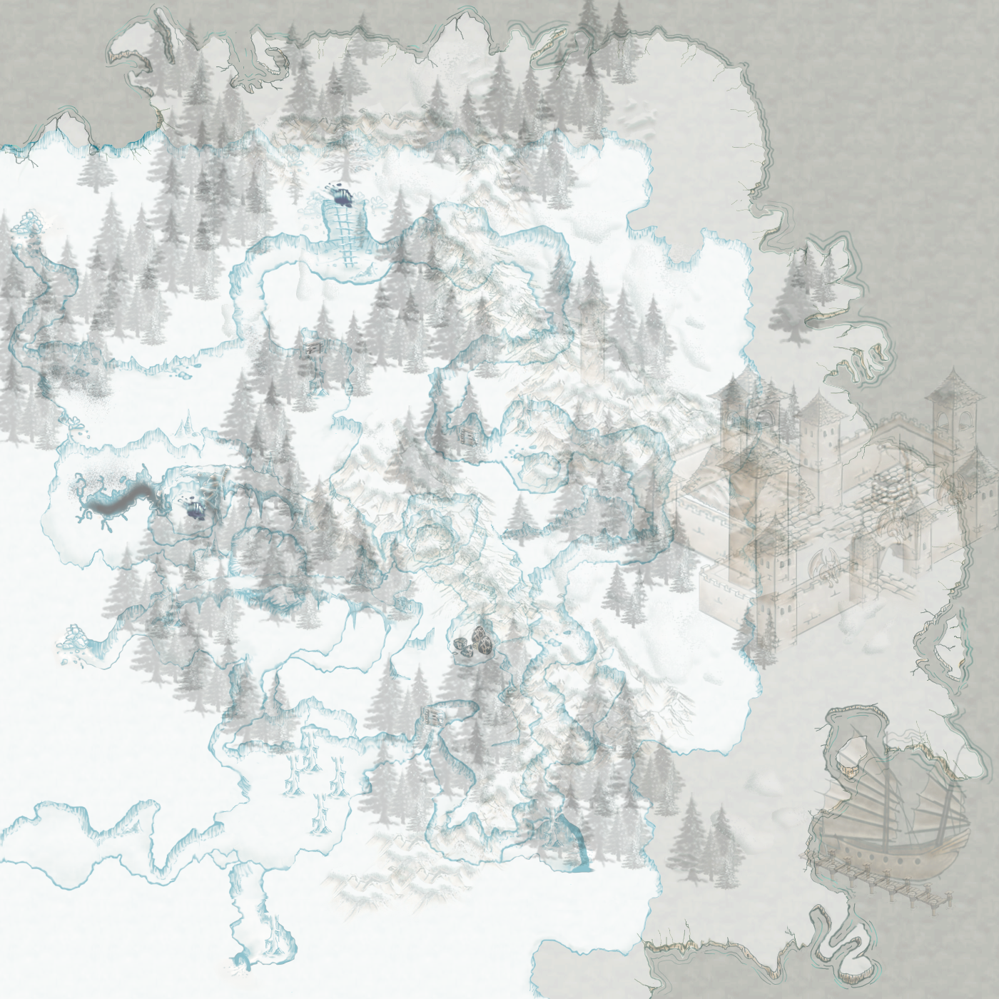
Here is a screenshot of a new document set up (note: I've used the moving tool to bring in guides for every fourth line, indicating the tile grid. In the Old World Style set series, there are numerous design elements that are centered in tile areas because of transparencies; so this also helps center those pieces): 


The snap to grid will let you quickly bring in and set up a sheet. You should be able to do this with all sorts of sets that download as individual tiles. I open the individual tiles four or five at a time, bring them into the tile sheet document and Ctrl -A to select the individual tile, Ctrl-C to copy and then Ctrl-V to paste in the tile sheet document. Once copied into the bigger sheet, close out the small files, and bring up five more. I will also use the Move tool (little arrow) to bring over guides from the rulers (Show --> Rulers) on the grid every fourth block, and move each tile into position. The snap feature lets you snap it to a grid very quickly. The transparent floating objects I usually set up in the middle of a grid square. 

When you go to Save, and this is for any set you create into a tile sheet - do 'Save As" and NOT "Save for Web". Under Save As, you can save the sheet as a PNG which will keep any transparancy (if there are transparencies or partial opacities) or as a JPG (if the tiles are solid), just by selecting the file type in the list. If you do the Save for Web feature, although nice and all, it reduces pixels to 72 dpi no matter what. Most of my sets are at that dpi, but other sets for other artists are not and you may lose resolution if you do that. It's not much, but you will be able to notice a difference.

By setting up in Photoshop, it allows you to get around the only 5 wide for Tiled from that plus feature. Usually, the max I do in width (with a few rare occasions) is six wide (or 840 pixels). If you are using GIMP, I believe you can set up similar documents. 

The unfortunate part of Tiled, is that it does not allow for resizing. Some larger objects will take up several grid squares. You can grab multiple grid squares in a Tile layer, but in in an Object layer, you can only grab one tile. If you set your grid to a 140x140, and a piece is 280 by 280 format fit, it will be divided into four pieces. Again, in a Tile layer, you can grab all of the pieces to place, but the Object layer, you would have to grab the parts and put them together on the map. I'm pretty sure they will be changing that in upcoming releases of Tiled, but for now, just know. That is a big drawback of Tiled versus Roll20's editor. Roll20's editor allows you to have varying sized tiles or design elements for easy placement. 

It takes a little bit to set up a sheet, but the plus side is - then you have a tile sheet designed the way you want it organized. Even better, once you have begun creating maps in TIled, you can save the map as an image (png or jpg formats) to bring into online editors, like Roll20. You can also create a bit of a hybrid - laying out the map base of continents, forests, rocks, etc. in Tiled. Then save the base map as a graphic, import it into Roll20, and continue to add to your map. 

Happy Mapping!


Sunday, March 29, 2015

Finishing up the mountain village, complete with Dungeon Buddies!

Welcome back to the blog. Once in a while, when I get time, I enjoy creating tutorials or, more in the case of this one, series of pictures, to show how I create certain scenes in Old World Style sets.

The last part of the mountain village, including some of Paul Ooshun's Dungeon Buddies sets, is all about playing. Playing with layers, primarily object layers, and just relaxing is key in finishing off a good scene. Grab that coffee, or tea, or La Croix, or whatever your drink of choice is and settle down to play.


One of the things I wanted to do is break up some of that rock. A perfect way to do that is by adding water. Again, playing with layer levels, several pools were added and then, starting at the top of the mountain, the water begins to come down the mountain.


Pulling back a bit further, we can  see how the water is now weaving in and out of the mountain ravines and down the mountainside. Waterfall elements are from set 8. 


Another change implimented: adding two more layers for the blue back drop and placing the partial opacity tile on a second and third layer behind the mountain to really emphasize the scene. Next up, Adding some Paul Ooshun's Dungeon Buddies.


From two sets by Paul Ooshun: Dungeon Buddies monster pack 2, and Dungeon Buddies Villagers, we can now populate the scene. I may have to beg Sir Ooshun to make a few more soldiers.


Orcs and Goblins done took over the mountain caves!!!


Apothecary, goat herder, guards and folks in the orchard...


The town is bustling with activity!


And in the upper left, we can see a hermit who has taken up residence in a nearby cave.


At any rate, thank you for watching!


Continuing from thumbnail to regional map in Old World Style

Continuing on, creating a map in Old World Style, using many elements from various sets created this past year.


Here is where we left off in the last tutorial example. At this point, really it is all about just layers and playing between tile layers and object layers. 


As you can see, from the size of our original map set up, there is a lot of space to continue to play with here. You can see in the lower right, there are multiple object and tile layers. To quickly place larger tile areas, I will switch between several tile layers in order to overlap, hide behind and just quickly set down multiple rocky surfaces. These are from set 4, ruins & other cultures. 


You can see here, it is somewhat reminiscent of the old game styles since it is on a grid. Tile layers automatically snap in Tiled, hence this look.


Playing more with object layers now, filling in cliff faces, creating some cuts for bridges. For this, I brought in some of the hard lines of cliffs in set 8 and placed them about in object layers. Some overlap the tops of rocky surfaces, some float 1/2 way, and some allow the loose rocks to lay on top. 


Now, let's lay in some pathways, bridges and begin to set some trees and other tidbits to help plan out where the town areas will go.


I did backtrack here just a tad. Using frame elements from Old World Style set 7: Chronicles, a frame was quickly popped in around the setting. Creating a new tile layer, the frame is set on top of the entire scene. If more tile layers and object layers are added, I will make sure to keep the frame layer on top. I've also gone back and erased the faded edge of blue that was around the top and top sides; and, once the frame is in, there were a few items in object layers that peaked out behind the sides of the frame. Easy fix! Just use the left mouse button and drag a quick, thin selection:


Then just use the arrow keys and nudge them into place, or until they are hidden along the left edge of the frame, or, if they are now showing, just delete the extra pieces. See? Easy!

In the next and last part of this, I will be showing pictures of decorating the scene more elaborately. 


Friday, March 27, 2015

From thumbnail to old world style

This is the first part of several parts, creating a scene using various elements of Old World Style sets.

To create not only a map, but perhaps more of a scene, I decided to take a quick thumbnail:


From the thumbnail, the next thing to decide upon was a size. 


For the purpose of this scene, I chose a 17 x 32 grid (at a 140 x 140 pixel grid). This ratio is very similar to portrait orientation on an 8.5 x 11 or even an 11 x 17 piece of paper, should someone wish to print out the scene.


After laying out the background layer, I have added a couple more tile layers and quickly switched between the two adding in some of the larger mountains in the most recent set 9, and side canyon wall pieces from set 4.


Now, layering in some object layers, a few more tile layers, the top of the mountain begins to take shape...


I've decided to put a monastery and church at the top, and will space out the village in spots below. Like several map editors, your scene builds up from back to front, and from top to bottom in perspective. Here you can see, by simply switching between tile layers and object layers, Tiled naturally overlaps and layers your elements; thus adding to depth and perspective.  In this shot, I've used elements from sets 2, 3, 4, and 1; as well as the rope bridge from set 6.

Stay tuned 

To see more of our sets, visit Roll20's marketplace. Each set may be purchased and downloaded to your computer.

Wednesday, March 25, 2015

R. A. Hapke: Old World Style Set 9: The Polar Regions is now up...

R. A. Hapke: Old World Style Set 9: The Polar Regions is now up...: Woohoo! OWS set 9 is now available at the marketplace! Icebergs, Glaciers, new and reworked coastlines, habitat markers and more!  ...

Old World Style Set 9: The Polar Regions is now up at the marketplace!

Woohoo! OWS set 9 is now available at the marketplace!


Icebergs, Glaciers, new and reworked coastlines, habitat markers and more! 

And while you are there, visit through the other OWS sets by myself...ahem..pure awesomeness...lol

Or take a look at all of my sets available under Russ Hapke


Tuesday, March 24, 2015

Generating ideas and possibly another style

I've been doing primarily one style for quite some time, and I've always love line art, but I like other styles as well. Sketchy, raw...fun...yeah...

Today was just a small sketch to get the brain pan fired up. This is another style to pursue soon:


The concept is from something else we're [a team of very talented artists and myself] working on at the moment. Well, really, this isn't part of that work...more like an offshoot of an offshoot of an idea of a potential notion. Still fun though... lol


Sunday, March 22, 2015

From one style to another...

Having some fun today, taking a simpler map from an online bud to redo in Old World Style maps:

The before:


And the after:


The map is unfinished and there is a lot of items to put in below the water's surface, but overall, I do believe it is turning out very nice.

And a quick series of stages: 


Want to try out some Old World Style map sets? Take a look at Roll20's marketplace!

Some freebies for Old World Style mapping

So, in helping an online buddy take a simple drawing and making it more complex using Old World Style, I had to make a few odds n ends icons to the world view.

Here are a few freebies for you to use and enjoy if you already have Old World Style set 1:

Farmland/Agriculture 1

Farmland/Agriculture 2

Massive castle icon

Choppy seas icon

Savannah / Grasslands icon

And, a couple of items, one from set 4, and one from set 3, resized and given a deep drop shadow:
Stone ruins for world view

Temple ruins for world view


Enjoy!
Russ

Friday, March 13, 2015

Opacities and Map Layers In Tiled

A little more, just for some quick ideas, using the opacity feature in Tiled to give hints to your players about what's to come, as well as laying out your map.


Per norm, we have our opening scene, that quaint little fort next to the sea. A shipping vessel docked. There is a pretty good supply of lumber here, and the foothills suggest some possible ore mining. But what ho! What is that little hole to the middle north? Let's explore!


Ok, normally I don't do a layer just for a single icon or design element, but this is one of those times that it might be a good idea. This allows your players to definitely focus on a point of entry. Here, the top layers are reduce in opacity to about 50%. We can see there is something happening down below - which if as the official map maker or DM/GM, you can also add a fog layer over the lower map and delete as you go.


Reducing the opacity of the top layers to about 10%. Our players are now immediately immersed in the cave system below; but you can still show a hint of the coastline if you wish - mostly for your players to understand large BOOM's may make sea walls come rushing in...eeps!


Or, take away the top layers totally by reducing them to 0% opacity. Let those players guess how thick the walls are. Mwah ha ha ha haaaaaaaa. - 'Sure! You can light that powderkeg to clear some of that ice and rocks from that area [evil grin]'


Monday, March 9, 2015

Reuse but not reducing - Ice Caves

The recent Old World Style set 9: Polar Regions got me thinking....


 I had reworked some of the old coastlines for a more polar feel, including the mountains, some snow, etc. Then it struck me...I wonder how the underground caves set would look if I reworked the coloring and such on those for glacial caves...?


...pretty well! 

Ok, so it looks like these will be included into another set, which will include a LOT more. This opens up for frozen lakes, LOTS of icicles, tracks in the snow and additional glacier/ice walls with transparencies. Hoodalolly and Happy Mapping!

I do believe there is a tutorial coming up in Tiled on making icy chasms and bridges...mmmm...


Ooo! I do believe it is time for another scroll edge too! Hoodalolly!