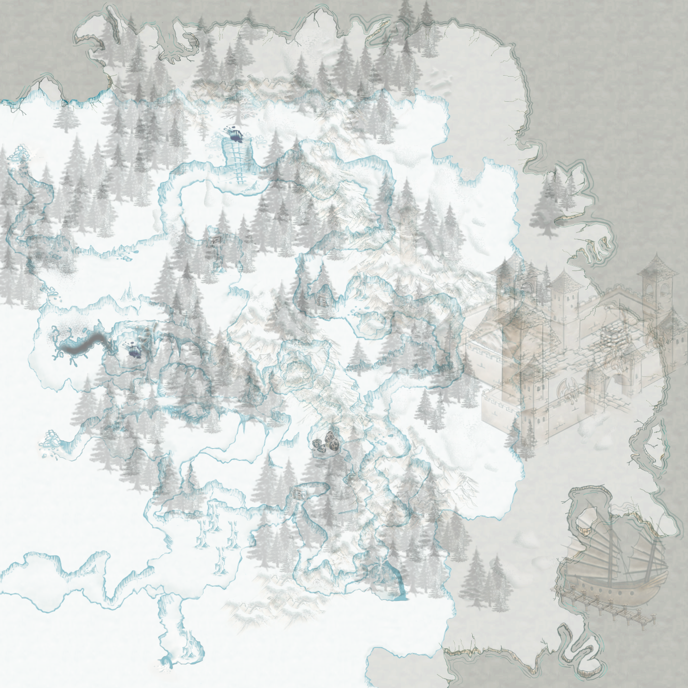
Per norm, we have our opening scene, that quaint little fort next to the sea. A shipping vessel docked. There is a pretty good supply of lumber here, and the foothills suggest some possible ore mining. But what ho! What is that little hole to the middle north? Let's explore!
Ok, normally I don't do a layer just for a single icon or design element, but this is one of those times that it might be a good idea. This allows your players to definitely focus on a point of entry. Here, the top layers are reduce in opacity to about 50%. We can see there is something happening down below - which if as the official map maker or DM/GM, you can also add a fog layer over the lower map and delete as you go.
Reducing the opacity of the top layers to about 10%. Our players are now immediately immersed in the cave system below; but you can still show a hint of the coastline if you wish - mostly for your players to understand large BOOM's may make sea walls come rushing in...eeps!
Or, take away the top layers totally by reducing them to 0% opacity. Let those players guess how thick the walls are. Mwah ha ha ha haaaaaaaa. - 'Sure! You can light that powderkeg to clear some of that ice and rocks from that area [evil grin]'


No comments:
Post a Comment