Wednesday, December 31, 2014

2014 wrap up

2014 for me was a great year, in several ways.

Of course, first and foremost, I was lucky enough to have shared another year with family and friends. And even though some think it is still a little silly, there is always time to say "I love you," especially when we part. That was a habit started nearly twenty years ago, and one that will hopefully never wane. I've met new friends, lost some folk along the way, but near or far, everyone still has part of my heart. It also fortunate to be reminded that sometimes, those you lost, are better to be lost than remain. If they don't see what they've done, you're sure never going to be able to show them. So, as someone once advised, move on.

But I digress...

This year was the first time spent really focusing on my art as a potential income. I've made half-assed attempts before; the occasional National Geographic or Discovery tidbit that luckily fell into my lap, or even a book or article...but never fully focusing on what I could accomplish. I've always felt that art and creativity is like breathing, essential for life itself, for growth, for learning. For years, I've pushed friends with their artistic and creative endeavors, some a bit afraid they might fuck up. So what?!? Hell, if I hadn't fucked up so much in the past, I wouldn't know what could be accomplished now. But anyway, yeah...I've pushed friends in their creative outlets, and to explore those outlets; however, never really pushed myself in that manner. Just fiddle farted about, trying this, trying that, never settling on one area to excel. That is, never settling til this year. And, it can't really be thought of as settling. No...settling means giving up other areas for one that you feel safe; so that's not it. If I had to narrow it down, I would say it is more like the pins in a tumbler, all falling into place, and those sequential moments creating an opportunity that for once did not go ignored.

This year was good. Numerous past experiences and education helped a lot. Understanding trends, in retail and social media, helped; but, going back to the basics probably meant the most. Going to back to what was true to me very early in the year (and really the very end of 2013) was probably the biggest kick in the butt ever.

So...What was it?

This...


Simple, isn't it? Just some simple lines from a very old love of maps...almost resembling scribbles. Since I've always believed that simple + simple + simple = complex. with a little color shading, simple lines became this...


Simple lines became a mountain. Simple shades in one color became light and dark. They became warm or cold; and most importantly, they became depth. 

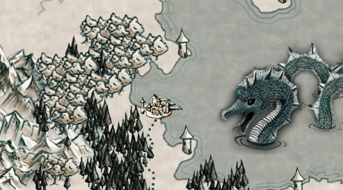
Now I wanted to see what was next to the mountain. What lay below? What lay behind? More shapes, created by a few more simple lines followed. And those also got some color. And soon simple became simple times a buttload and created this...


And from here it expanded. Sure, with simple lines I could create a world...but then I wanted to get closer - to see the town near the valley by the trees and found how much more fun that simple + simple could be.


 I found a place that took a chance with these simple line arts. There was a marketplace that was already selling full color, intensely detailed pieces; and for a moment, because I had these almost monochromatic simple silly little shapes, there was doubt.

Now doubt...well, doubt is a bitch. It is the nagging older sibling of fear. It is the second guessing of self worth. Luckily, there is also the youngest sibling, "Fuckitwhatthehell." Being right is great. We all want to be right, find the right path, choose the right choices; but "Fuckitwhatthehell" is that go for it moment that can bring about a pretty freaking awesome change.  The owners of the site liked the mountains. They liked the rivers and the dots, the dashes and the shades. They took a chance. I took a chance.

And the most wonderful thing happened. Other people liked those silly little simple lines with simple shades; and soon others were creating worlds and lands where their minds could imagine all sorts of possibilities. Over the months, more silly little simple lines and shapes were created, until there were literally over a thousand of these simple little pieces. People started looking me up through the blog and social media, and I was lucky enough that they began to share their creations with me; and they asked questions about the work.

So, Fuckitwhatthehell won out and I'm glad that emotional sibling did. It is good to see that you can be a positive effect on others; but freaking great to see you can be a positive effect on your own life.


Wednesday, December 24, 2014

Chronicles Example Sheets

Examples of the tilesheet and sample from Chronicles Set 1 (200 dpi):


Cave Set 1 Example

Tile Sheet example from Cave Set 1: 200 dpi:


Graphic shown at approximately 50% size - based on a 140 x 140 pixel grid system.


Ancient Scribe Set 1 Examples

Tile sheet example from Ancient Scribe Set 1:


Shown at approximately 50% of original size - based on a 140 x140 pixel grid system


Scene Additions 3 Example

Tile sheet example from Scene Additions 3:

Scene Additions 2

Example of tile sheet for Scene Additions 2:

Scene Additions 1

Example of the tilesheet from Scene Additions 1:


Small Town

Small Town map set of 3 preview, 72 dpi: The actual graphic sizes are 3640 x 4760 pixels...so they are huge!


Old World Style Set 6 at 72 dpi

Examples of the Old World Style Set 6 at 72 dpi


Old World Set 5 at 72 dpi

Examples of the tile sheets for Old World Style Set 5: Other World at 72 dpi


Old World Set 4 at 72 dpi

Example sheets from Old World Set 4 at 72 dpi:


Old World Set 3

Example tilesheets from Old World Set 3 at 72 dpi.


Old World Set 2: 72 and 200 dpi examples

First, from the 72 dpi set:


And the 200 dpi set:


NOTE*: the 72 dpi set and the 200 dpi set are sold separately.


Old World Style Set 1: 200 dpi examples

Extremely similar to Old World Style Set 1, the 200 dpi set is made more for those who want to print out their maps and really want a cleaner, crisper edge to the lines. File sizes are a bit larger than their 72 dpi counterparts, and may slow the performance of older computers when creating large scale maps.


Old World Style Set 1 Examples

Alas, the website doesn't allow for big enough previews of the tilesheets, so I am setting up viewing areas on the blog for the sets as they go up. I am setting these up  prior to launch so that I can have them ready for potential customers.

Examples for Old World Style Set 1: World View 72 dpi


Friday, December 19, 2014

Ever closer to reality

Ok, so the first batch of items are ready and set up in the catalog for the website; and now it is down to the nitty gritty details. Having never done this type of webshop prior, my reservations are mostly because of wanting potential customers to like not only what is being sold, but other details about us as well.  And that means a lot of patience.

When I approached this initially, never in my wildest thoughts would I have imagined the amount of detail that goes into creating an e-commerce shop on the web! The catalog seemed daunting itself, but that feeling quickly passed once all the ins and outs were understood. Now, the GTC, The Privacy Statement, customer database, sales database, etc., every last little bit of detail must be created, looked over, looked over again, get a cup of coffee, and then looked over for a third time. All T's are crossed and i's dotted.

I look forward to the days when we can hire an e-shop assistant, but for now it is a valuable learning experience in understanding how the business will be run.

Thursday, December 18, 2014

A great don't need must have

A friend sent this link to me via social media: http://www.thinkgeek.com/product/173a/

The perfect gift for someone who needs nothing, but loves something with a bit of geek!

Sunday, December 7, 2014

The difference in DPI

Just a quick note this evening as we continue to ready sets for the Gaming Geeks. The site as we've said before, will be carrying digital tile sets - several of which are already available at Roll20.net at their marketplace. The on-screen tiles for Roll 20 are at a 72 dpi, perfect to create maps for online activities.

On the Gaming Geeks site however, because we are striving to carry tiles more for those who want to print out their maps and designs, we are upping the dpi. That means going back to the original layered files, reworking layers slightly to add cleaner lines; and sets will be between 200-300 dpi, depending on the set.


Both at a magnification of 200%. The picture on the left carries the 72 dpi with digital color washes and partial transparencies - great for online graphics, and for computers (like mine) that are a dual core or less. Less processing power is needed to create the maps using these. On the right, we have a rework on the pine forest token, but you can see, the lines are much cleaner and will help create a better print. This doesn't mean someone can't use the 200 dpi reworked set for computer graphics, just as long as their computer can handle the amount of data for their map and handle the transparencies while playing.

Either set works beautifully when printed, as I have tried them both out; I'm just somewhat a bit more OCD when it comes to printed work and want to provide the best possible set I can for that medium. Again, 72 dpi great for online; grater than that great for print.

Saturday, December 6, 2014

Just a reminder when working in graphics and resolutions

As I rework digital tile sets for the Gaming Geeks site, I thought I would throw out a simple reminder to those who work in changing graphic resolution, or mainly those who don't work in it that much at all:


  • Always remember it is much easier to work from higher to lower resolution if changing the amount of dpi
  • When saving, especially in programs like Photoshop, use the "Save As" feature instead of the Save for Web. Unless your program allows you to change the dpi in the web safe mode, it [saving it in the 'svae for web' feature] will take your graphic back down to 72 dpi. Not fun...
  • When increasing a graphic's resolution, I've read the whole uncheck resample image bit and the continual small increment resizing method, and I've tried it. Personally, since much of the digital tiles are line art so far, it has proven easier to take it into another program and vectorize the graphic first with a live trace; and either finish in that program or bring it back to the original program, create a new document and resize the graphic manually. 
  • Work in higher resolutions...period. You can always save to a lower dpi setting.